RED Carbon Standard
UX case study

Project Overview

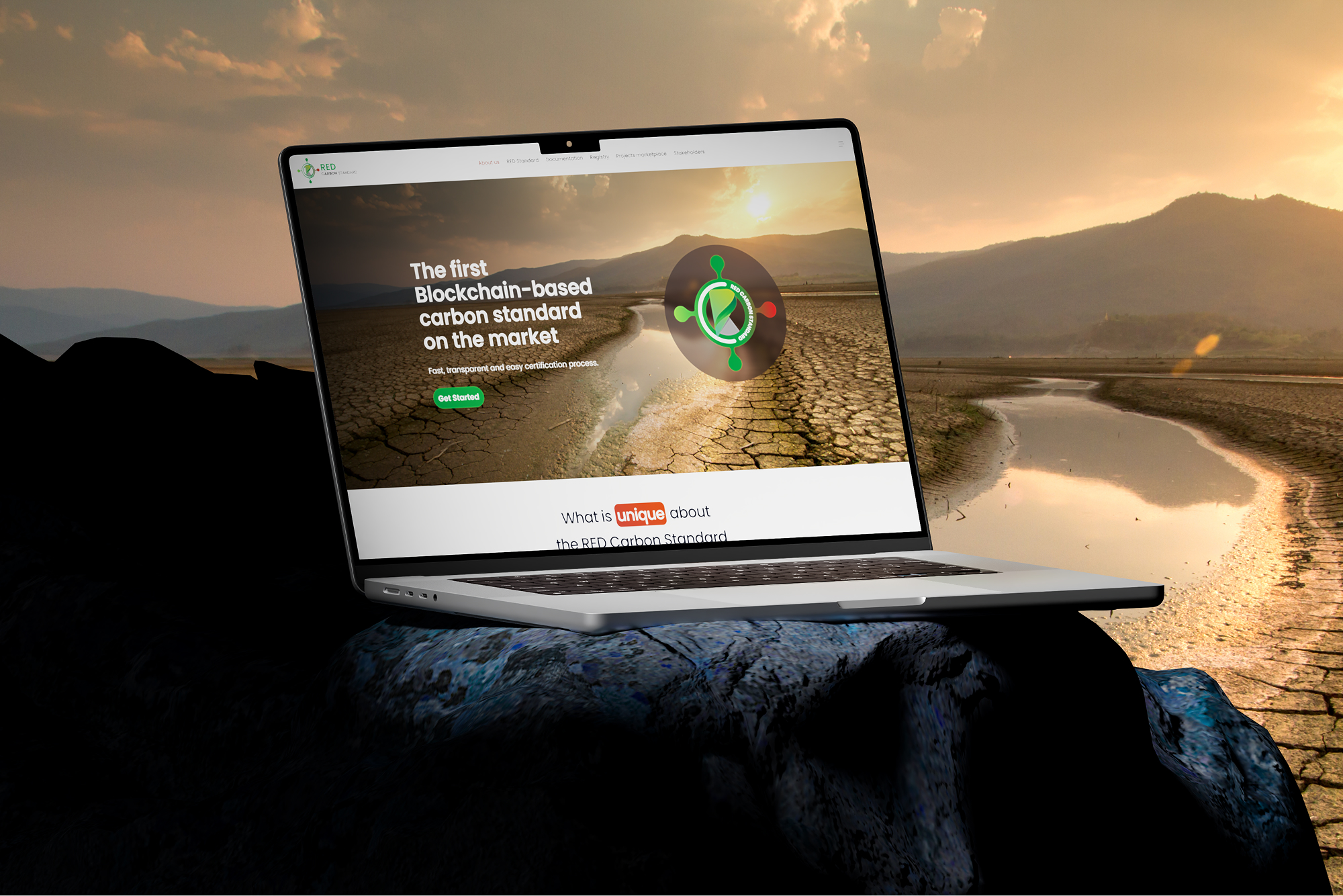
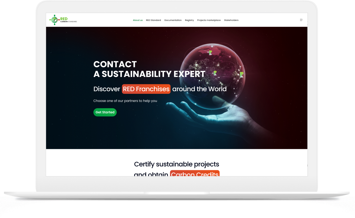
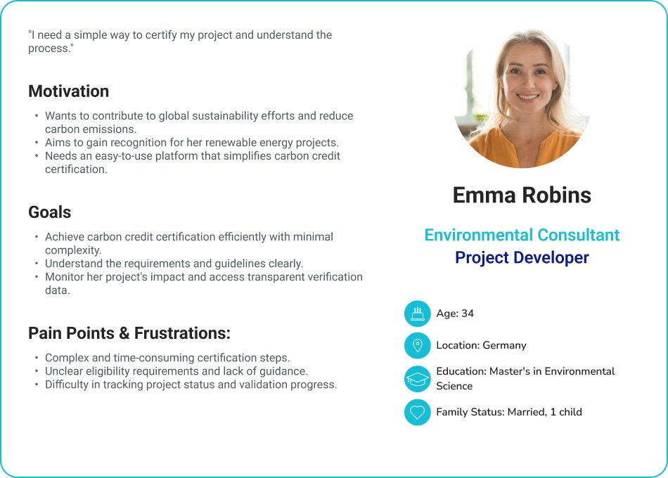
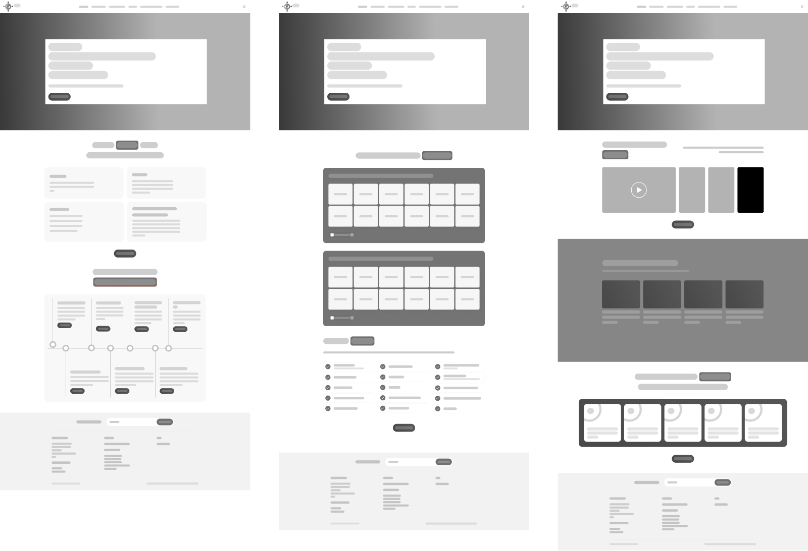
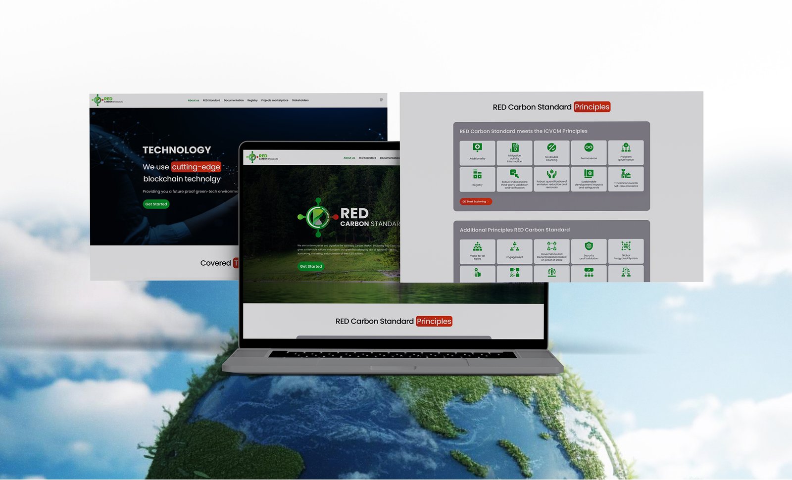
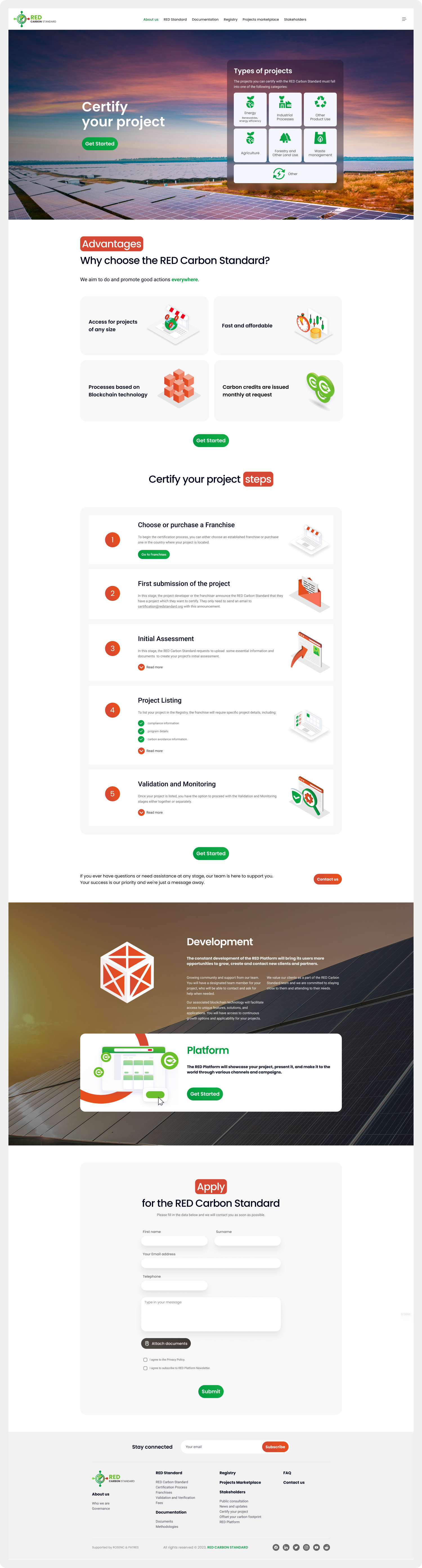
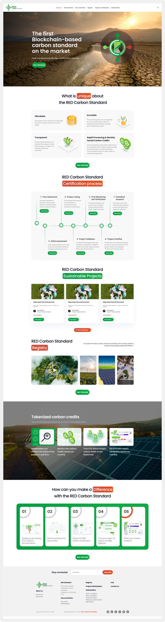
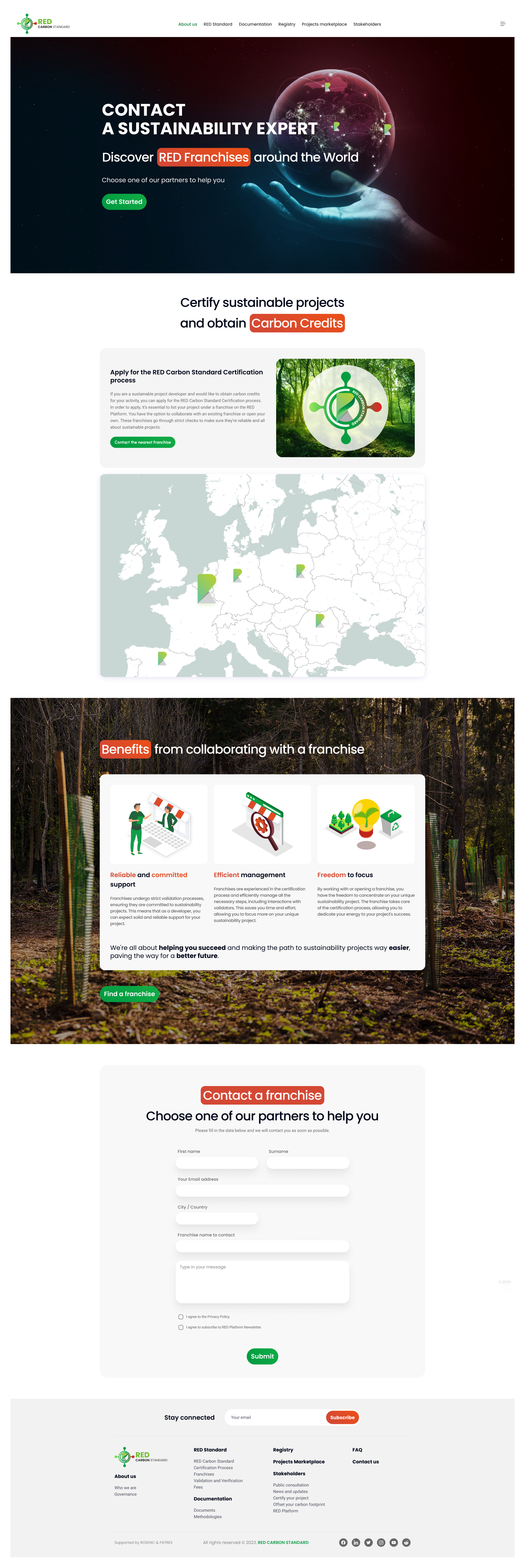
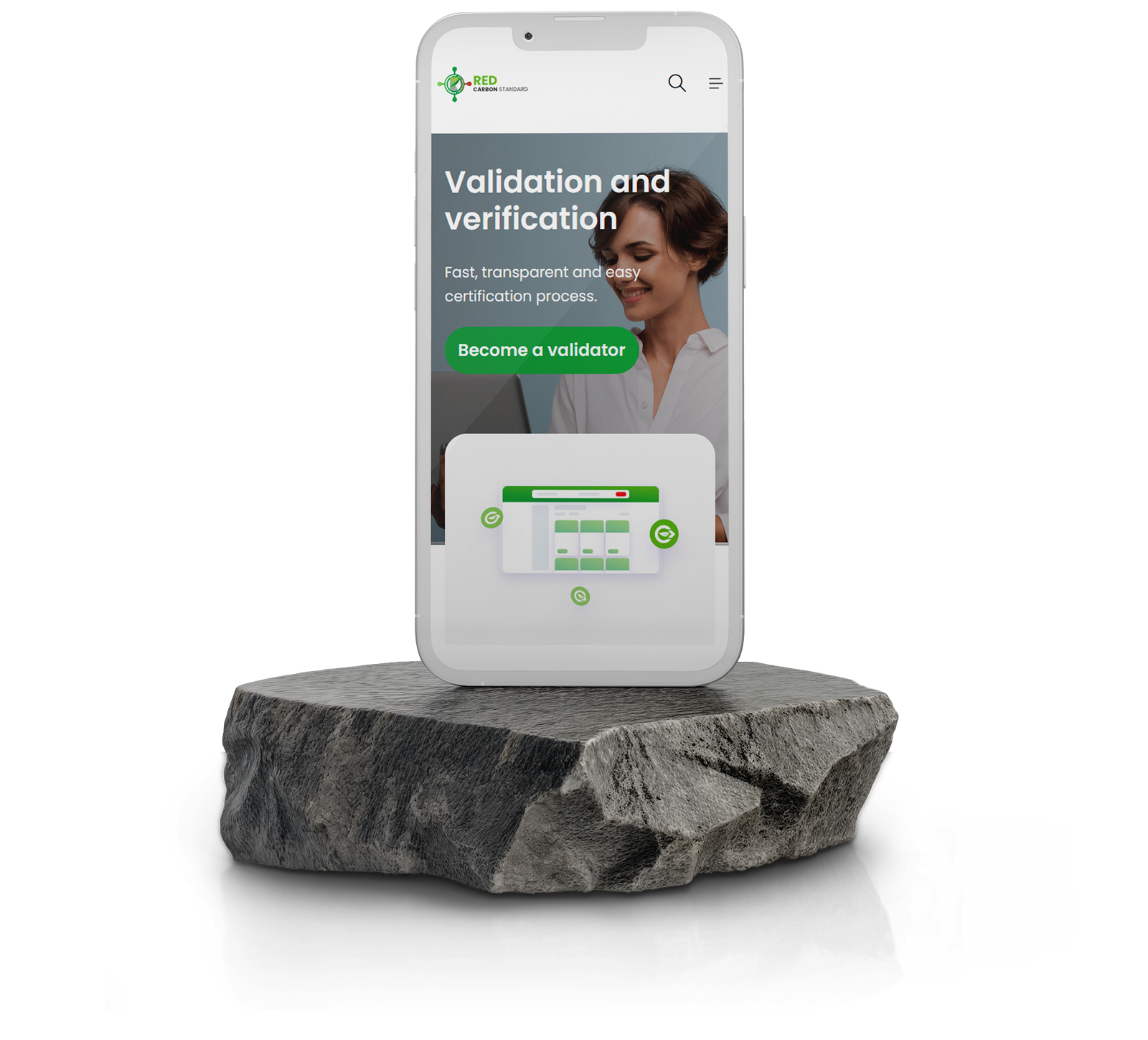
The RED Carbon Standard landing page was designed to provide a seamless, engaging, and informative experience for users looking to certify sustainable projects and trade carbon credits. The primary objective was to simplify complex information, establish trust through blockchain transparency, and drive conversions by guiding users toward key actions such as project certification and carbon credit transactions. The design process focused on optimizing the user journey, ensuring accessibility, and maintaining a visually compelling interface that aligns with the platform’s sustainability-driven mission.

The problem

Users faced challenges such as:

Responsibilities

As the UI/UX Designer, I was responsible for:

The goal

The goal of the landing page was to create a clear, engaging, and conversion-focused experience that helps users quickly understand the purpose of the RED Carbon Standard, build trust, and guide them seamlessly toward project certification or carbon credit trading.

User Research

We analyzed platforms like Verra, Gold Standard, and KlimaDAO to identify gaps. Most lacked real-time verification, user-centric UI, and blockchain security.

The design process

To ensure an intuitive and efficient user experience, I started by sketching paper wireframes to explore layout ideas before transitioning to digital wireframes and creating a low-fidelity prototype. This approach allowed for early feedback and iteration before moving into usability testing with stakeholders.

I drafted multiple layout variations to explore different ways the information could be structured.

Visual Design

At this stage, I focused on creating a clean, intuitive visual design that enhances usability and aligns with the RED Carbon Standard’s focus on green energy attributes. Green tones symbolize sustainability, while orange earthy tones convey warmth and environmental responsibility. Clean typography and distinct icons improve readability and navigation.

Outcome

Expected Outcomes & Impact

The expected outcome of the landing page is to drive higher user engagement through a structured and visually engaging layout, increase trust and credibility with blockchain-backed transparency, and provide seamless navigation that helps users find relevant information quickly. By simplifying the project certification process, the design aims to encourage more users to take action. Since real-world testing has not yet been conducted, key metrics such as bounce rates, session durations, CTA clicks, and conversion rates will need to be tracked to validate these assumptions.

Key Takeaways

A key takeaway from this project is that clarity drives action, and a clean, structured landing page significantly improves user flow and conversion potential. Trust elements such as blockchain verification, certifications, and testimonials help reinforce credibility. Simplifying complex processes by breaking them down into digestible sections enhances accessibility and usability. A mobile-first design is essential to ensure seamless engagement across different devices.

Next steps

The next steps involve conducting user testing and conversion tracking through A/B testing, heatmaps, and analytics to measure engagement and optimize conversion rates. Gathering real-world insights will help refine UI elements, CTAs, and content structure.